How to Add Colour to a Neutral Interior (Without Losing the Calm)
The designer's approach to introducing colour to a neutral home, the 80/20 rule, one hero colour, and how to add it without losing the calm.
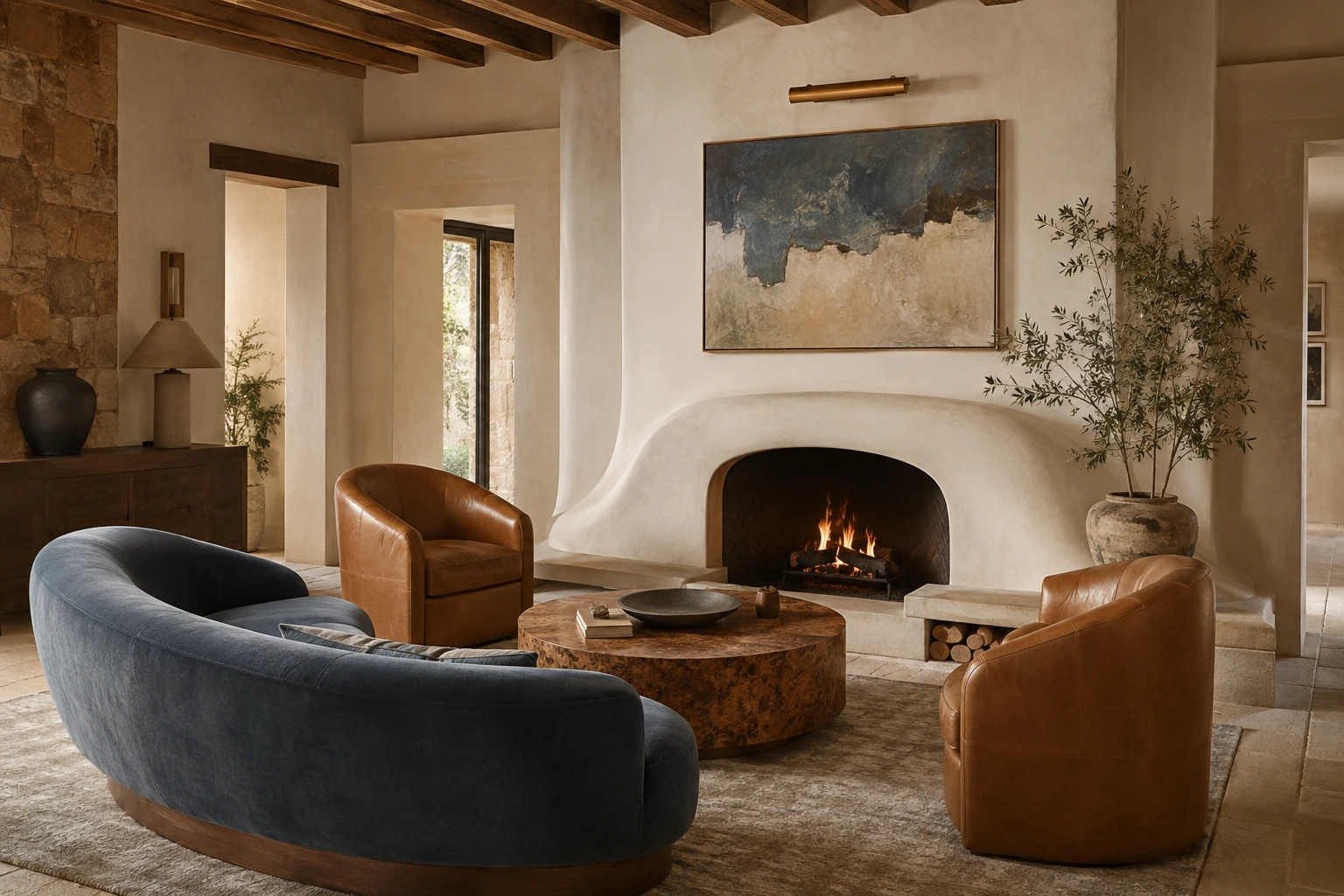
There's a moment that comes for almost everyone who has built a beautiful neutral home. You've done the cream walls, the oak, the linen and the boucle, the whole calm, considered envelope, and one day you stand in the doorway and think: this is lovely, but it's a little bit flat. Not wrong. Just quiet in a way that has tipped from serene into safe.
The instinct at that point is usually one of two extremes. Either you decide colour isn't for you and leave it beige forever, or you panic-buy a teal accent wall and a set of clashing cushions and undo the calm you worked so hard for. There's a much better third option, and it's the one designers actually use: introduce colour deliberately, in the right amount, in the right places, so the room gains life without losing its composure.
If the calm base is still taking shape, start with warm minimalist interiors. Here's exactly how to add colour once that base is in place.
Why neutral rooms go flat (and why colour is the fix)
A neutral room leans on texture and tone to create interest, cream on oatmeal on sand, linen against stone against timber. That works beautifully, but it's a narrow band of the spectrum, and the human eye craves a little contrast to have something to land on. Without a single point of difference, even a gorgeous room can read as one long, soft blur.
Colour is what gives the eye somewhere to rest. Done right, a single considered hue doesn't fight your neutrals, it frames them, the same way a warm charcoal anchor makes a warm-white room feel intentional rather than washed out. The goal is never to abandon your neutral base. It's to earn it a focal point.
Start with the 80/20 rule
The single most useful principle for adding colour to a neutral space: keep roughly 80% of the room neutral and let 20% carry the colour. That ratio is what separates a designed room from a chaotic one.
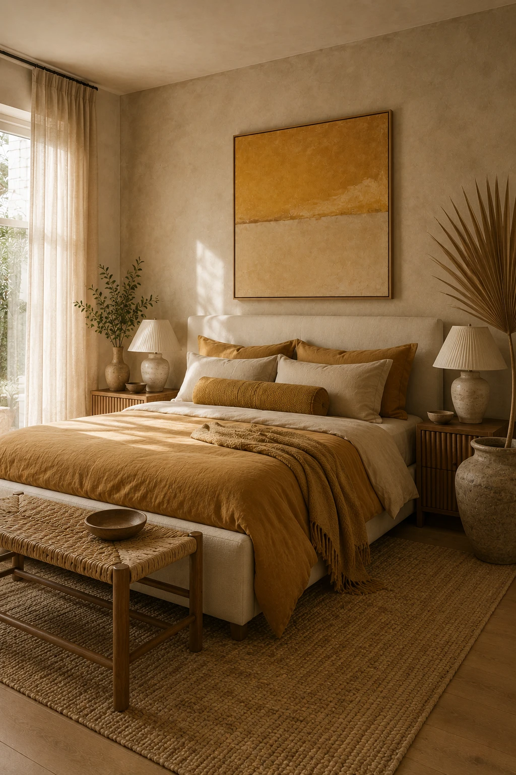
When your walls, floors, rug and largest upholstered pieces stay in the warm-neutral family, a bold colour introduced in that remaining 20%, a sofa, a pair of chairs, an artwork, reads as a deliberate, expensive choice. Flip the ratio and pile colour everywhere, and the room loses the calm that made it worth building.
If you're nervous, start even smaller. A 90/10 split using nothing but cushions, a throw and a piece of art will tell you whether you love a colour in the space before you commit to anything upholstered.
Choose one hero colour, not five
The most common mistake is reaching for a whole rainbow because you're finally "adding colour". Resist it. Pick one hero colour and let it do the work.
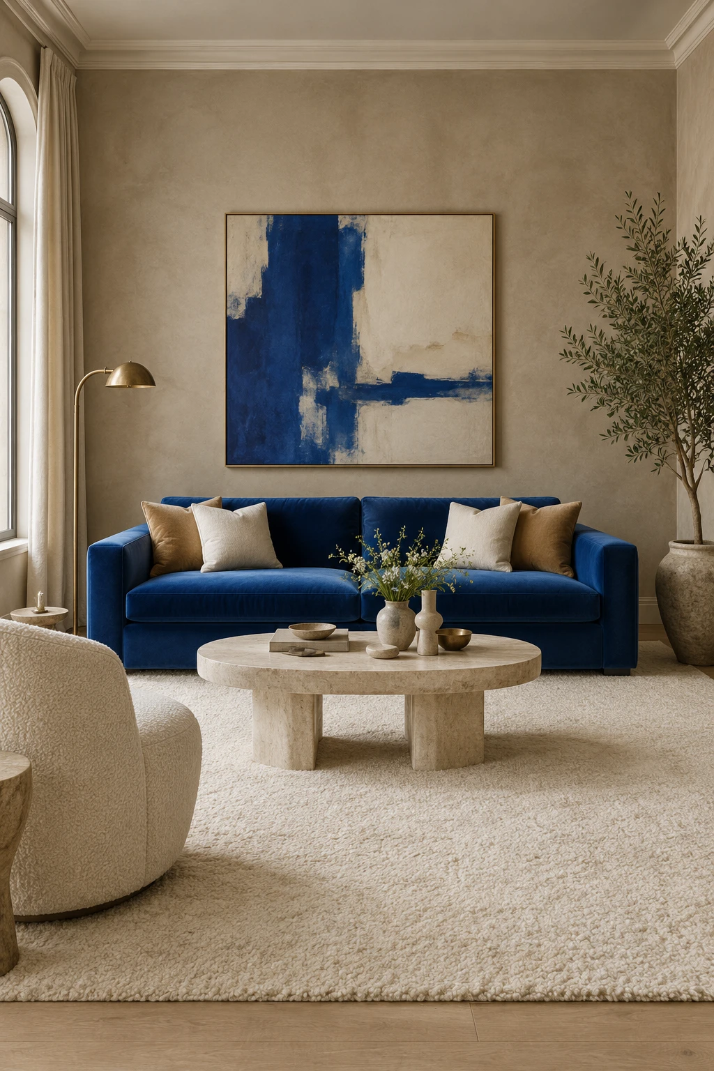
A neutral base is endlessly flattering, which means almost any single colour will look good against it. The magic is in restraint: one colour, repeated two or three times around the room so it feels collected rather than accidental. A cobalt sofa, echoed in one cushion and a line in the artwork, reads as designed. A cobalt sofa, a mustard chair, an emerald ottoman and a red vase read as a furniture showroom.
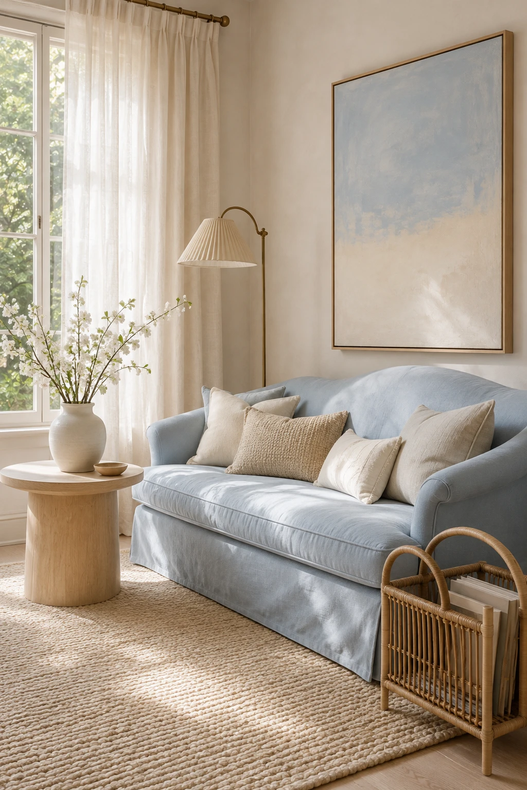
Some hero colours that sit beautifully against warm neutrals:
- A gorgeous deep blue, cobalt, sapphire or a moody navy, for a crisp, timeless contrast against cream and oak.
- Vibrant mustard or ochre, for warmth that still feels grounded and earthy.
- Emerald or forest green, for a rich, slightly glamorous note that plays well with brass.
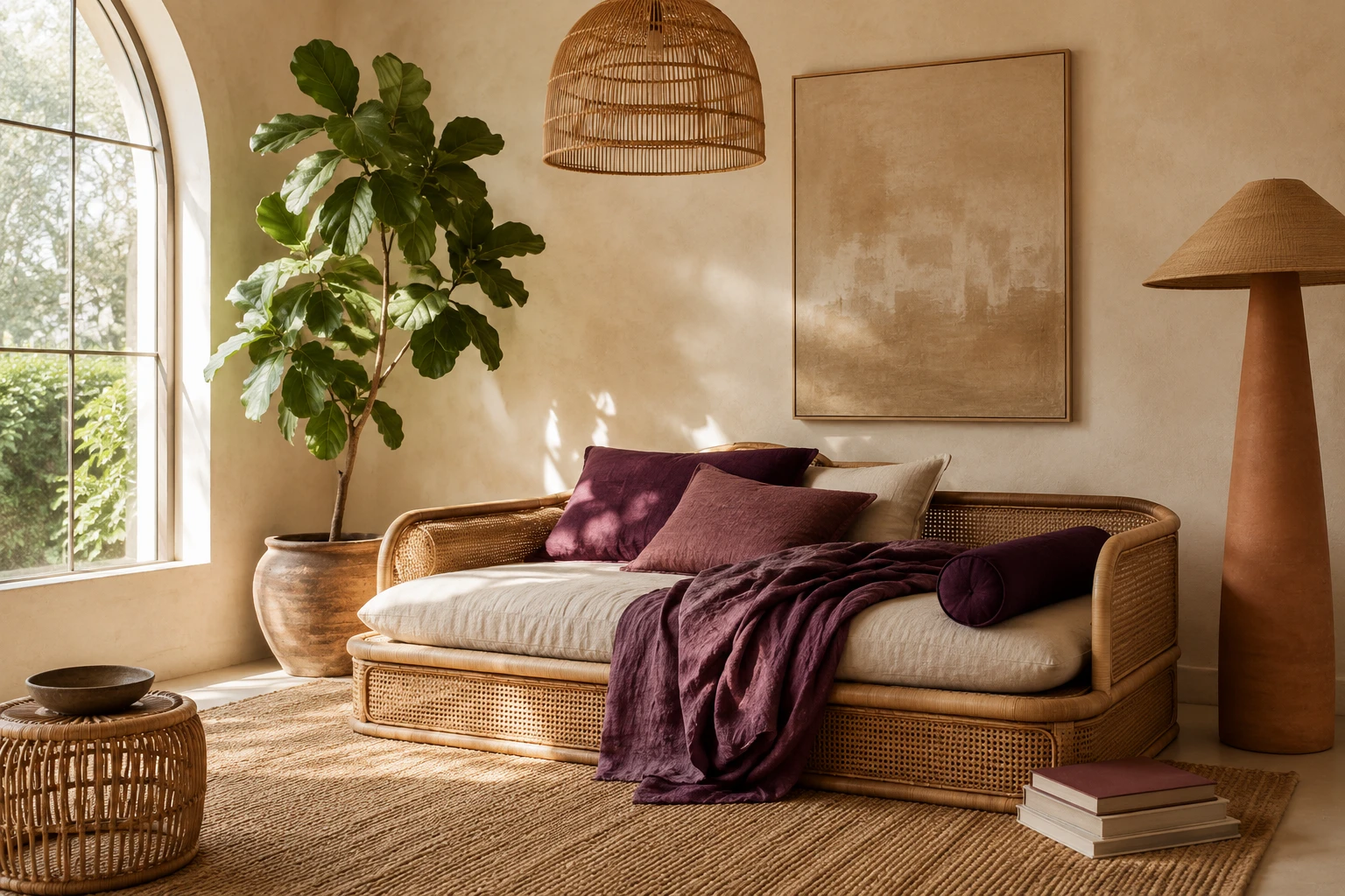
- Oxblood, burgundy or rust, for depth and a cocooning, sophisticated mood.
- Terracotta or warm clay, the gentlest step out of neutral, barely a colour, more a warm-up.
Notice these are all saturated but warm-leaning tones. They have enough depth to hold their own against a rich neutral base, which is what stops the accent looking thin or accidental.
Repeat the colour at least twice
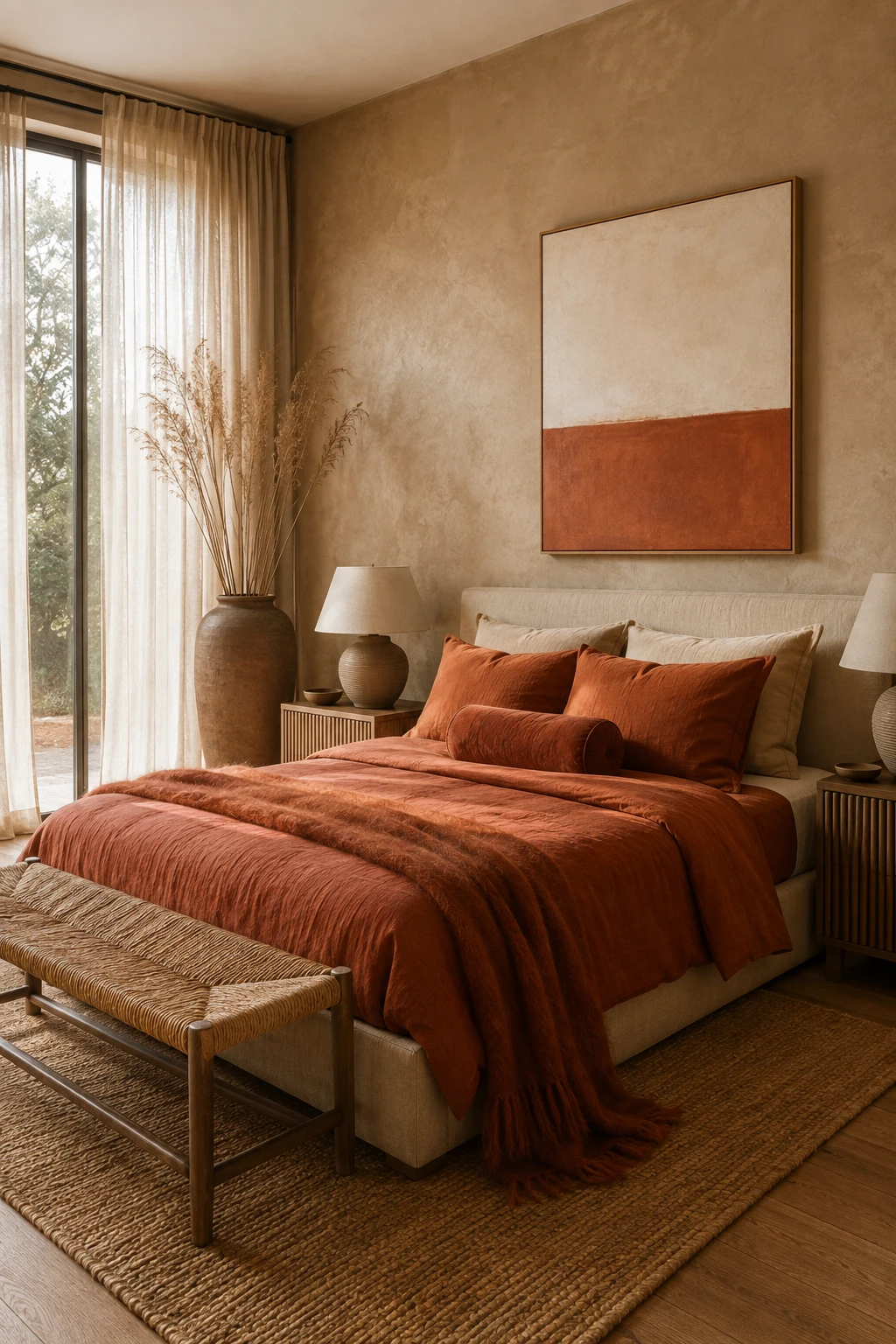
This is the rule that makes a room look professionally styled, and almost nobody follows it: whatever accent colour you introduce, use it at least twice. A single spot of colour with no echo looks like a mistake the eye keeps snagging on. The same colour appearing two or three times reads as intentional, "collected", the word designers reach for.
So if your hero is a burgundy velvet sofa, pick up that burgundy again in a cushion on the opposite chair, or a line in the artwork above, or a single stem in a vase. The repetition ties the room together and gives your eye a gentle path to travel, rather than one loud full stop.
Let material carry the colour
Where you put a colour matters as much as which colour you pick. The most luxurious way to introduce a hue into a neutral room is through a rich material rather than a flat painted surface.
Velvet is the designer's secret here. A velvet sofa or a pair of velvet chairs in your hero colour catches the light, shifts tone as you move around it, and reads as considered and high-end in a way a block of paint never will. Other material-led ways to add colour without a paintbrush: a hand-knotted rug with a colour woven through it, a large textural artwork, a glazed ceramic lamp, a run of coffee-table books, a single blown-glass vase.
Leaning on material also keeps colour reversible. A cushion cover, a throw or a piece of art can be swapped in a season if your taste shifts, where a painted feature wall is a weekend and a tin of primer to undo.
Room by room
Living room. The easiest place to start, because it has the most surfaces to play with. Keep the walls, rug and largest pieces neutral, then let a single hero piece carry the colour: a velvet sofa or a pair of accent chairs. Echo the hue in one or two cushions and the artwork, and stop there. Everything else stays calm so the colour has room to shine.
Bedroom. Colour in a bedroom works best kept soft and enveloping, this is a room for rest. A moody green, dusty blue or warm terracotta on the bedhead or in layered bedlinen adds depth without energy. Keep the walls neutral and let the bed be the moment.
Kitchen. The most permanent room, so the most cautious. Rather than committing to coloured cabinetry, introduce colour through the things you can change: bar stools in a rich tone, a run of ceramics on an open shelf, a single piece of art. If you do want colour built in, an island in a deep hue against neutral perimeter cabinetry is the lowest-risk way to do it.
Dining. Dining chairs are a brilliant, low-commitment place for colour, a set of velvet chairs in your hero tone around a neutral timber table transforms the room. Add a single sculptural piece or an artwork that repeats the colour and the scheme is complete.
Bathroom. Keep the hard finishes neutral and let colour arrive through soft, swappable things: towels, a stool, a single piece of framed art, a coloured-glass tumbler. Colour is lovely here but expensive to get wrong in tile, so keep it in the accessories.
Common mistakes (and easy fixes)
Adding too many colours at once. The fastest way to lose the calm. Fix: commit to one hero colour and build the whole scheme around it. You can always add a second, quieter accent later.
Choosing a colour that fights your neutrals. A cool, blue-based grey accent in a warm cream room will always look slightly off. Fix: match the temperature. Warm neutrals want warm-leaning colours; keep the undertones in the same family.
Spreading colour too thin. One cushion, one candle, one stem, all different, reads as clutter, not colour. Fix: concentrate the colour into fewer, larger moments and repeat the same hue rather than scattering many.
Going straight to a feature wall. It's the biggest commitment and the hardest to balance. Fix: prove the colour with soft furnishings and art first. If you still love it after a month, then consider paint.
Forgetting the anchor. Even a colourful room needs one deep, grounding tone, a charcoal, a walnut, a black. Fix: keep a single dark anchor in the room so the colour and the neutrals both have something to push against.
How to try colour in your own space first
The genuinely hard part of adding colour is picturing it in your room before you spend a cent on a sofa you can't return. That's exactly what StudioReno is for. You can take your existing neutral room, drop in a cobalt velvet sofa or a set of mustard chairs with real products, and see how the colour actually sits against your oak, linen and stone, then swap it for emerald, or oxblood, or nothing at all, until it feels right. No 3D software, no guesswork, no expensive mistakes.
Not sure which direction suits you? Take the two-minute style quiz to find your interior style, then build it into a room you can actually see.
If an accent still feels too shy, colour drenching and dark green rooms are where colour can go next.
Try colour in your own room, free →
FAQ
How much colour should I add to a neutral room? A good rule is to keep around 80% of the room neutral and let 20% carry the colour, concentrated in one hero piece plus a couple of echoes. If you're nervous, start at 90/10 with just cushions, a throw and art before committing to anything upholstered.
What colours go best with a neutral interior? Warm-leaning, saturated tones work best against warm neutrals: deep blue, mustard or ochre, emerald green, oxblood or burgundy, and terracotta. Match the temperature of the accent to your base, warm neutrals want warm colours, and you almost can't go wrong.
How do I add colour without painting? Lean on materials and soft furnishings: a velvet sofa or chairs, a rug with colour woven through it, a large artwork, ceramics, a throw and cushions. These add rich colour, catch the light, and can be swapped later if your taste changes, unlike a painted wall.
Why does my neutral room feel flat? Neutral rooms rely on texture and tone, which is a narrow band of contrast. Without a single point of difference for the eye to land on, even a beautiful room can read as one soft blur. One considered hero colour, plus a dark anchor, usually fixes it instantly.
Should I use a feature wall to add colour? It's the biggest commitment and the hardest to balance, so it's rarely the place to start. Prove the colour first with a sofa, chairs, art or cushions. If you still love it after living with it for a few weeks, then consider paint.