Colour Drenching: How to Get the Bold Look Right (Without the Regret)
Colour drenching is the immersive 2026 paint trend: one rich colour on walls, trim and ceiling. Here's how to do it, the best colours, and how to test it before you commit.
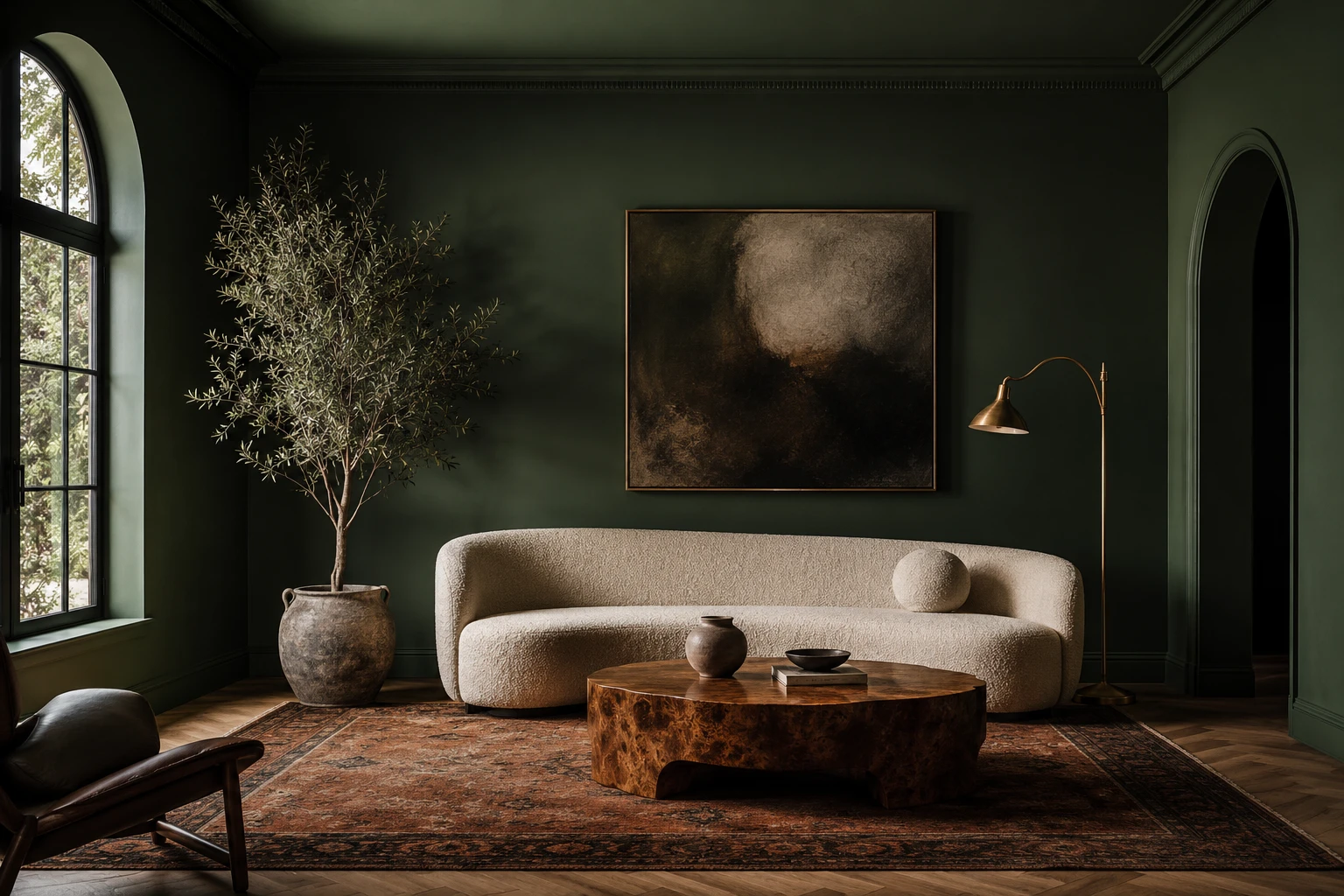
There's a reason your feed is suddenly full of rooms wrapped head-to-toe in one deep, delicious colour. Colour drenching (painting the walls, trim, skirting and ceiling all in the same shade) has quietly become the look of 2026. It's immersive, cocooning, and it makes an ordinary room feel like a considered, high-end space. Designers have been quietly doing it for years; now everyone wants in.
It's also the single scariest paint decision most people will ever make. Committing an entire room to one bold colour (walls and ceiling) feels like a very expensive way to find out you've made a mistake. So this guide covers both halves: how to colour drench beautifully, and how to know it'll actually work in your room before you open a single tin.
What is colour drenching, exactly?
Colour drenching means taking one colour and using it on nearly every surface of a room: the walls, the ceiling, the trim, the skirting boards, the window frames, and often the doors and built-in joinery too. Instead of the traditional "white ceiling, white trim, colour on the walls" formula, everything melts into a single, enveloping tone.
The effect is seamless. With no hard line where the wall stops and the ceiling or trim begins, your eye glides around the room uninterrupted. That's what creates the "cocooning" feeling everyone talks about, and, counter-intuitively, it's also why colour drenching can make a small room feel bigger, not smaller.
Doesn't a dark colour make a room feel smaller? (The big myth)
This is the fear that stops most people, and it's mostly wrong. A small room painted with white walls and a white ceiling actually announces its own edges, every corner and boundary is outlined in contrast, so your eye stops at each one and the space reads as boxy.
Colour drenching removes those visual full-stops. When the walls and ceiling are the same tone, the boundaries blur and the room feels more expansive and intentional, not cramped. Deep colours also add a sense of depth, so the walls feel like they recede rather than close in. The trick isn't avoiding dark colours in small rooms, it's committing fully, so there are no jarring breaks to shrink the space.
Why colour drenching works so well
- It looks expensive. A fully drenched room reads as deliberate and designed, the kind of thing you'd expect from an interior designer, not a weekend DIY.
- It hides awkward architecture. Boxed-in pipes, uneven walls, a random bulkhead, chunky radiators, paint them all the same colour and they disappear into the scheme instead of drawing the eye.
- It creates instant atmosphere. Drenching a room in a moody green, warm terracotta or deep plum gives it a mood and a point of view that a single accent wall never could.
- It's a shortcut to cohesion. You don't have to agonise over which trim colour "goes", everything is the same, so it can't clash.
The best colours for colour drenching
The 2026 palette is warm, earthy and enveloping. These are the colours doing the heavy lifting right now:
Deep forest & olive greens: the most popular drench of all. Green feels natural and calming, pairs beautifully with timber, brass and cream bouclé, and works in almost any room.
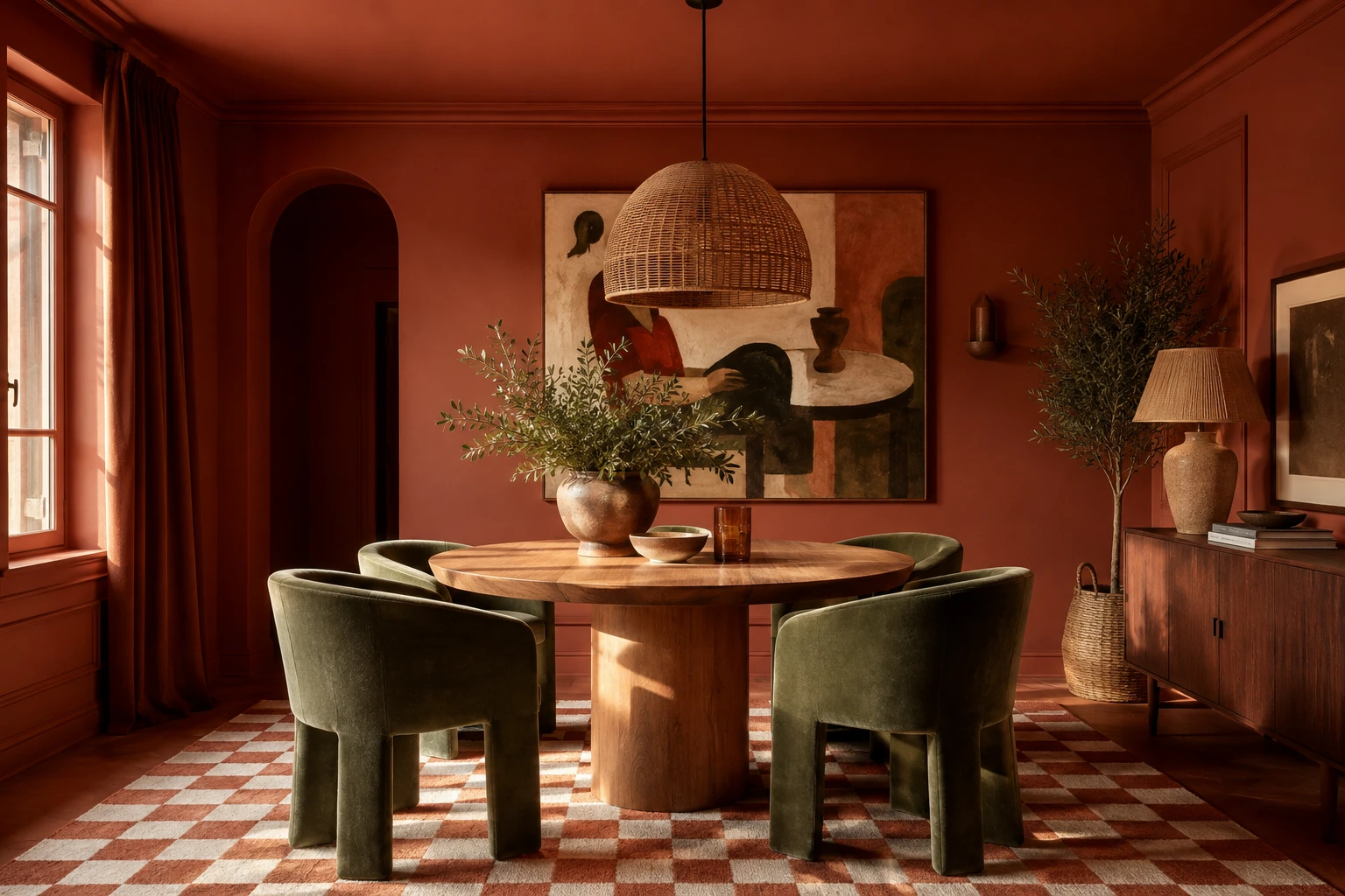
Terracotta & warm rust: cosy, characterful and a little Mediterranean. Gorgeous in a dining room, especially with green velvet and natural textures.
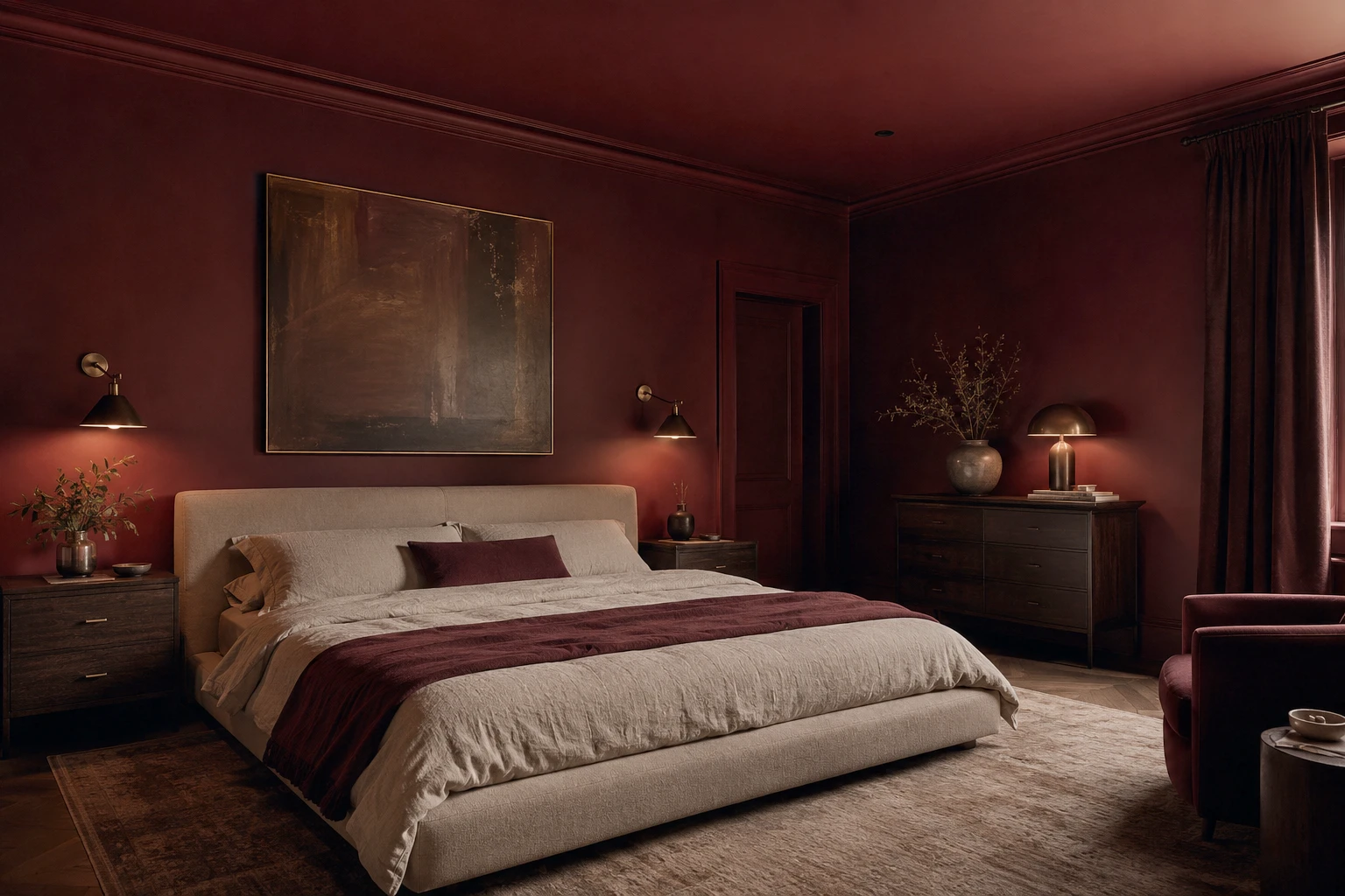
Plum & aubergine: dramatic and luxurious, especially in a room you use at night. Stunning with warm metallics and moody art.
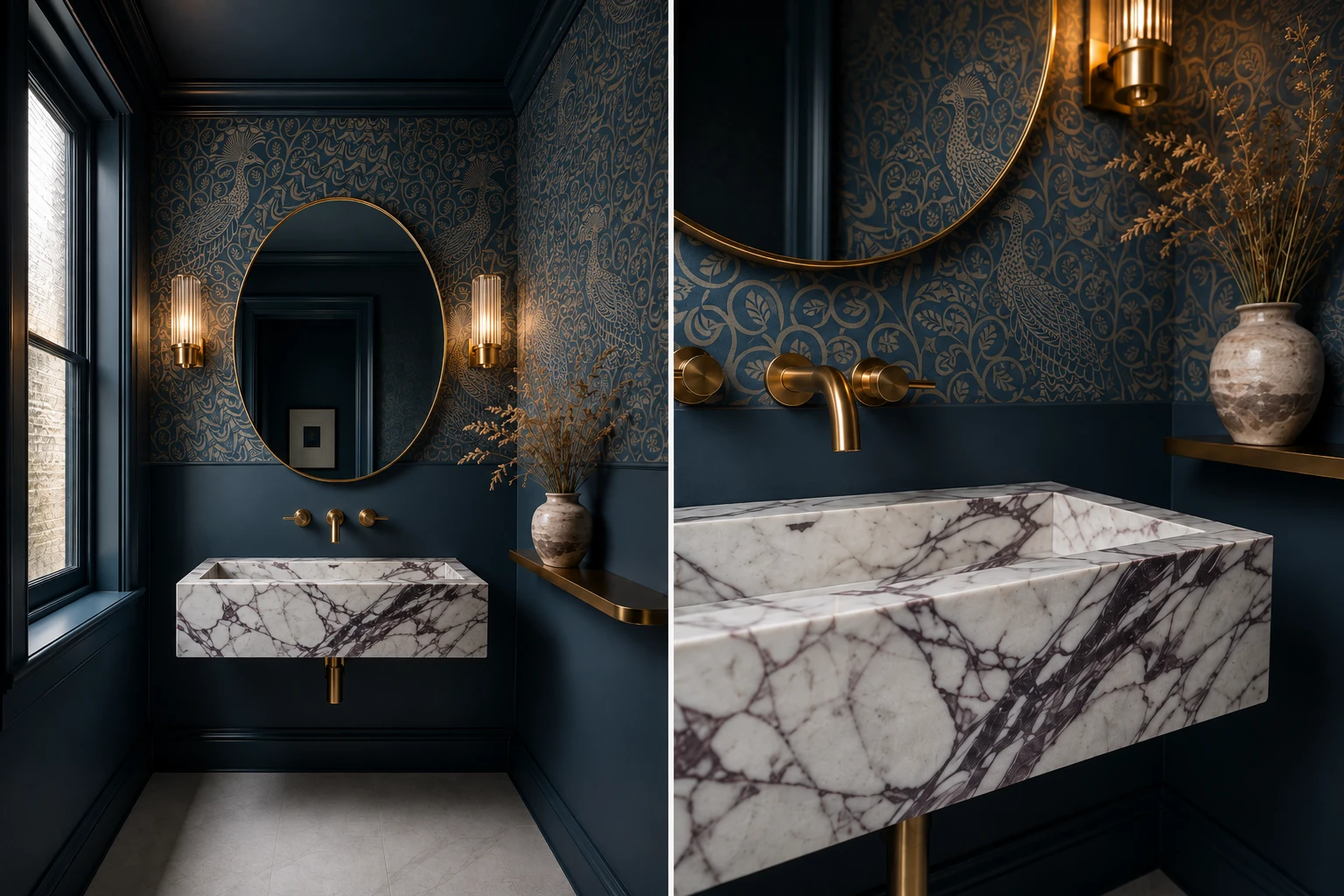
Moody blues & teals: from soft slate to deep peacock. A safer "bold" that still feels calming, a great entry point.
Oxblood & chocolate brown: the sleeper hits of the year. Rich, grounding and unexpectedly warm, brilliant in bedrooms.
Warm mushroom & putty: for the drench-curious. A tonal, earthy neutral gives you the immersive effect with almost none of the risk.
Room by room
Powder rooms and small bathrooms are the perfect place to start. They're small, low-stakes, and a windowless little room is made to be drenched in something dramatic, a jewel-toned powder room feels like a delicious surprise.
Bedrooms are ideal for the cocooning effect. A deep, enveloping colour makes a bedroom feel restful and hotel-like, oxblood, forest green and moody blue all excel here.
Dining rooms love drama, and they're often used in the evening, so a rich, saturated drench comes alive under warm light and candlelight.
Living rooms and studies benefit from the grown-up, layered feel a full drench brings, just balance the depth with plenty of natural light and texture.
How to colour drench a room (the right way)
- Commit fully. The number-one mistake is going halfway: coloured walls but a white ceiling, or skipping the trim. Half-measures look unfinished and lose the entire immersive effect. If you're drenching, drench everything.
- Play with sheen, not colour. For subtle depth, keep the colour identical but vary the finish: a matte or eggshell on the walls and ceiling, a slightly higher sheen (satin) on the trim and joinery. Same colour, quiet dimension.
- Layer texture so it doesn't go flat. One colour everywhere can read one-note without contrast. Bring in natural materials (timber, rattan, linen, bouclé, stone) plus metallics and soft textiles to catch the light and add richness.
- Mind the light. The same colour looks wildly different in a bright north-facing room versus a dim south-facing one (reverse that for the northern hemisphere). Warm-toned drenches flatter low-light rooms; cooler ones can feel flat without good natural light.
- Warm up your lighting. Layered, warm lighting (lamps, wall lights, a dimmer) is what makes a drenched room glow rather than feel like a cave. Skip the single harsh overhead.
The one step everyone skips: see it before you commit
Here's the uncomfortable truth about colour drenching: a paint swatch on the wall tells you almost nothing. A 10cm square of "deep green" gives you zero sense of what the whole room (walls, ceiling, trim, in your actual light, with your actual furniture) will feel like once it's drenched. And this is a look you can't half-undo. Getting it wrong means repainting an entire room, ceiling included.
That's exactly the problem StudioReno solves. Instead of guessing from a swatch, you can build your actual room, drench it in the colour you're considering, drop in the real furniture and pieces you're eyeing, and see it as a photorealistic room before you spend a cent on paint. Test forest green against olive. See whether the terracotta works with your existing sofa. Try the bold thing with zero risk, and only commit once you're sure.
Try colour drenching your own room in StudioReno, free early access →
Colour drenching FAQ
Does colour drenching make a room look smaller? Usually the opposite. Removing the contrast between walls, trim and ceiling blurs the room's boundaries, so the space feels more expansive and cohesive rather than boxy.
What finish should I use? Matte or eggshell on walls and ceiling for a soft, modern look; a slightly higher sheen like satin on trim and joinery adds subtle depth while keeping the colour identical.
Do I really have to paint the ceiling too? For the full immersive effect, yes. A white ceiling breaks the spell and makes the room feel unfinished. If you're nervous, start in a small room like a powder room.
What are the best colours for beginners? Warm mushroom, putty, soft sage or a muted blue give you the drenched effect with far less risk than a deep, saturated tone.
Is colour drenching expensive? The paint itself isn't. The cost of getting it wrong is. That's why testing the full look virtually first (before buying paint or committing a whole weekend) is the smartest move you can make.
The takeaway
Colour drenching is bold, beautiful and easier to pull off than it looks, as long as you commit fully, layer in texture and warm light, and choose a colour that suits your room's natural light. The only real risk is guessing. See the whole look first, in your real room, and the scariest paint decision becomes the easiest.