Will It All Go Together? How to Know Before You Buy
The hardest part of decorating isn't picking things you love, it's knowing whether they'll work together once they're in the same room. Here's how to tell if your colours, furniture and finishes go together, and how to see the whole look before you spend a cent.
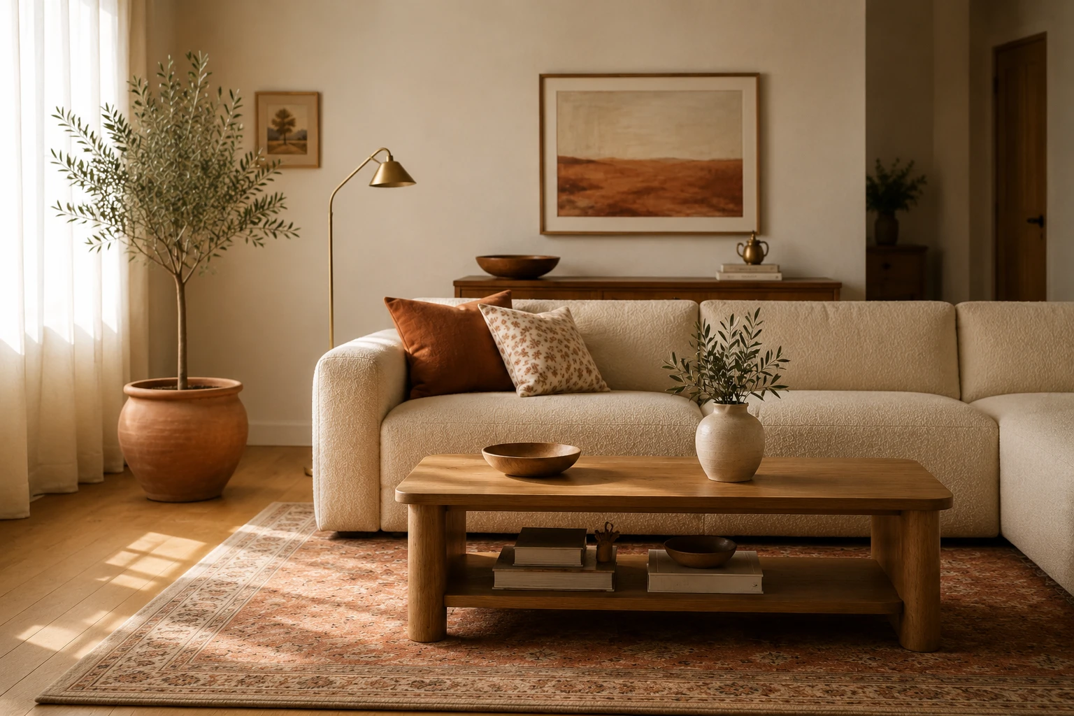
Here's the thing nobody tells you about decorating a room: the hard part isn't finding things you love. That's the easy, fun part. The hard part is knowing whether all those things you love individually will actually work together once they're in the same room. A sofa you adore, a rug you fell for, a paint colour you saved months ago, and a timber you picked separately can each be beautiful on their own and still add up to a room that feels somehow off.
This is the single most common reason a room disappoints, and it's almost entirely avoidable. Here's how to tell whether your pieces go together, the rules that quietly make a room feel cohesive, and the honest way to know for sure before you commit.
Why "I love it" isn't the same as "it goes together"
Loving something is about the piece. A room working is about the relationships between pieces: how the sofa's warmth sits against the wall colour, whether two different timbers argue or harmonise, how the rug pulls it all together or splits it apart. You can pick ten wonderful things and end up with a room that feels busy, cold or disjointed, because you were judging each item alone, on a screen or in a showroom, never together in your actual space.
Cohesion is a skill, not luck. And most of it comes down to a few principles.
The rules that make a room feel like it goes together
1. Give it a palette, and stick to it
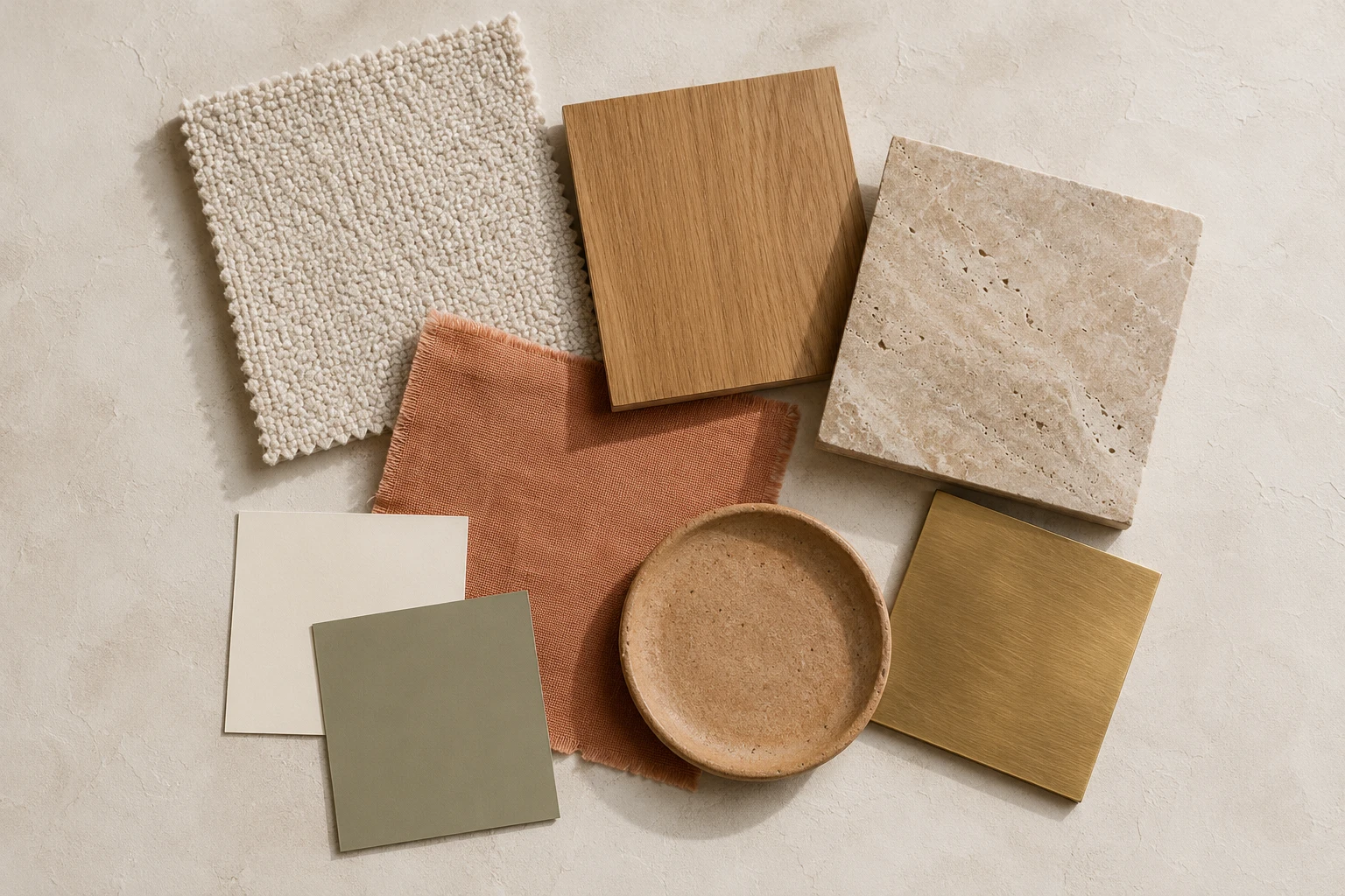
A cohesive room usually runs on three to five colours, no more: a dominant tone, a secondary, and one or two accents. Everything you bring in should belong to that palette. The fastest way to make a room feel chaotic is to let every new purchase introduce a new colour.
2. Repeat things on purpose
Cohesion comes from repetition. A colour that appears in the rug, a cushion and a piece of art feels intentional. A brass that shows up in the tapware, a lamp and a frame ties the whole room together. Pick a few materials and metals and echo them around the space rather than using one of everything.
3. Mind your undertones
This is the invisible one. A warm white and a cool grey can technically be "neutral" and still fight, because their undertones clash. Warm sits with warm, cool with cool, unless you're contrasting them on purpose. Most rooms that feel subtly wrong have an undertone mismatch at the bottom of it.
4. Mix, don't match (but mix with a thread)
A room where everything matches perfectly feels like a showroom; a room where nothing relates feels random. The sweet spot is variety held together by a common thread: different shapes and eras, but a shared palette, or a repeated material, or a consistent level of warmth.
5. Balance the visual weight
A big dark sofa needs something to answer it across the room. A busy patterned rug wants calmer surfaces around it. Cohesion is partly about spreading the "loud" elements out so no one corner overwhelms the rest.
The clashes that quietly ruin a room
A few specific mismatches are behind most "it just doesn't feel right" rooms:
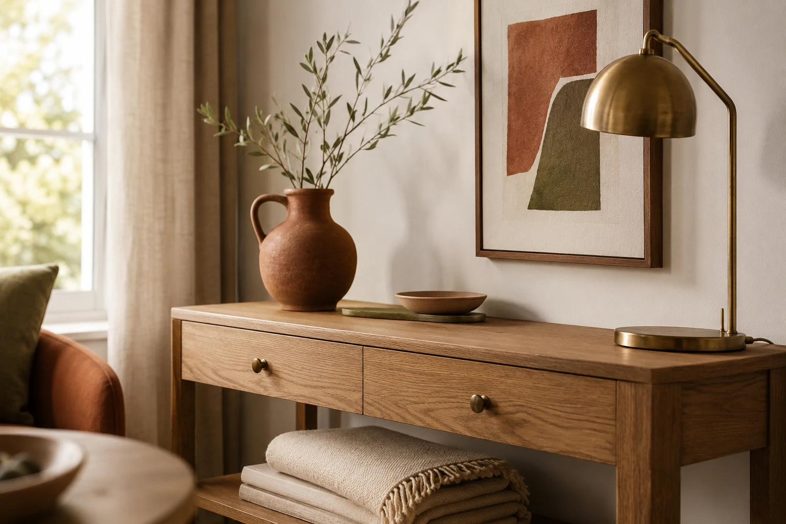
Two timbers with opposite undertones (a cool grey-oak floor under a warm honey-toned table). A warm-white wall against cool-white trim, or vice versa. A rug whose colours don't appear anywhere else in the room. Too many competing "hero" pieces all shouting at once. And the classic: a paint colour that looked perfect on the chip but goes muddy next to the floor and furniture you already own.
None of these show up when you judge pieces one at a time. They only appear when everything is finally in the room together, which, traditionally, is far too late to change your mind.
The honest problem: you can't really tell until it's all in the room
You can follow every rule above and still be guessing, because a palette in your head, a swatch in your hand and a product photo on a website are not the same as seeing it all together in your space, in your light. Timber undertones shift. A colour reads differently at scale. The rug looks different next to the actual sofa than it did in the listing. By the time everything's delivered and installed, you've spent the money, and undoing it is expensive and exhausting.
That gap, between "I think these go together" and "I can see that they do," is exactly where the risk lives.
How to actually see it before you commit
This is precisely what StudioReno is built for. Instead of picturing whether your pieces work together, you bring the real products and finishes you're considering into your actual room and see the whole thing come to life as a photorealistic image, before you buy anything. You drop in the sofa, the rug, the paint colour and the timber together, and you can simply see whether they create the feeling you're after or whether something's fighting.
You catch the clash while it's still free to fix. You see whether the whole room feels cohesive and calm or busy and off. And because every piece in the render is a real product, your finished look doubles as a shopping list of things you already know work together. It turns "I hope this all goes together" into "I can see that it does."
Loving each piece is where you start. Seeing them work together is how you know.
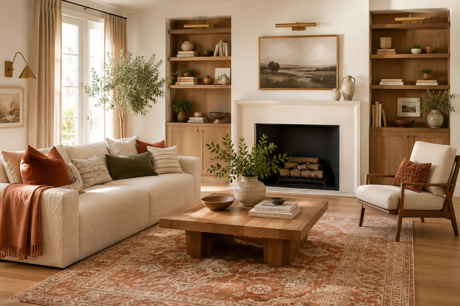
See if your whole room goes together before you buy. StudioReno, free early access →
Will it go together? FAQ
How do I know if colours go together in a room? Work from a tight palette of three to five colours, repeat each colour in more than one place, and check that your undertones agree (warm with warm, cool with cool). Colours that share an undertone and appear more than once almost always read as cohesive.
Why does my room feel off even though I love everything in it? Usually because the pieces were chosen individually rather than as a group. Common culprits are clashing undertones, too many competing statement pieces, or a colour (often in the rug or a timber) that doesn't repeat anywhere else. It's the relationships between pieces, not the pieces themselves.
How many colours should a cohesive room have? Around three to five: one dominant, one secondary, and one or two accents. Fewer can feel flat; many more tends to feel busy. The key is that everything you add belongs to that palette.
Do all my timbers and metals need to match? No, and matching them exactly can look flat. They should relate, not match. Keep timbers in the same undertone family (all warm or all cool), and repeat each metal finish a few times so it looks deliberate rather than accidental.
How can I tell if things go together before buying? The most reliable way is to see the actual pieces together in your real room before you commit. Tools like StudioReno let you bring the real products and finishes into your space and view the whole look as a photorealistic image, so you can spot a clash while it's still free to change.
The takeaway
A room that "goes together" isn't luck, it's a tight palette, repeated colours and materials, agreeable undertones, and balanced visual weight. But even with the rules, you're guessing until you see it all in one place. So before you spend, see the whole look together in your actual room, because the difference between hoping it comes together and knowing it does is the difference between a room you love and a costly redo.
Build your whole room and see it come together, free. StudioReno early access →