Terracotta & Warm Earthy Interiors: How to Get the Look
Warm earthy interiors use terracotta, rust, clay and ochre alongside natural materials like timber, rattan and stone to make a home feel cosy, grounded and inviting. Here's the palette, the materials, and how to get the balance right.
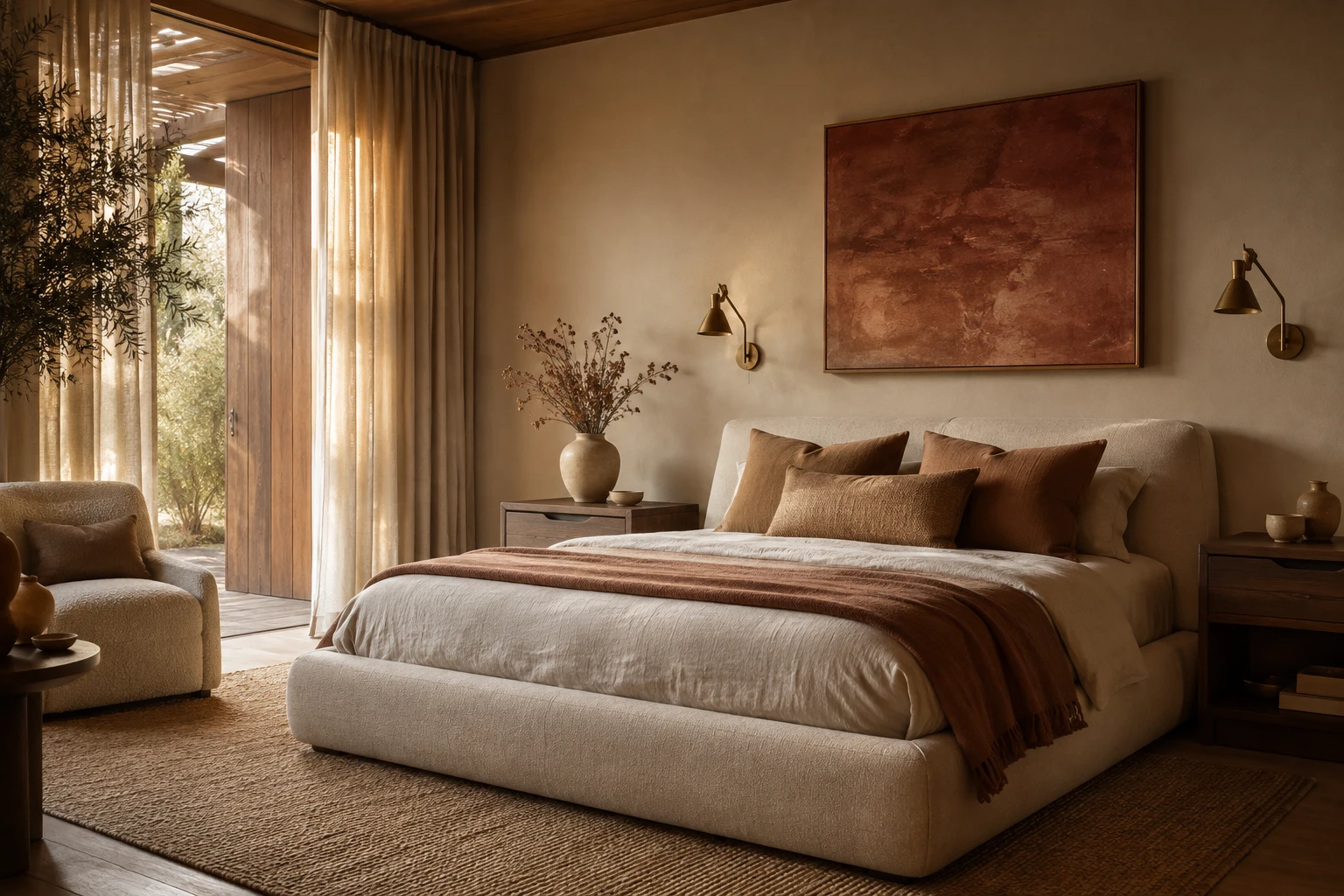
After years of cool greys and stark white minimalism, homes have swung warm. Terracotta and earthy interiors, all clay, rust, ochre and sun-baked browns layered with natural materials, have become the defining cosy look, and unlike a lot of trends this one feels timeless rather than fleeting. It's the difference between a room that looks like a showroom and one that feels like a hug.
Here's how to build the look, the colours and materials that make it sing, and how to get the balance right so it reads rich and considered rather than muddy or dated.
What "warm earthy" actually means
Earthy interiors take their palette straight from nature: the colour of clay, of terracotta pots, of desert sand and autumn leaves. Instead of cool blue-greys, everything leans warm, from the paint to the timber to the textiles. The result is a home that feels grounded, calm and welcoming, the design equivalent of golden-hour light.
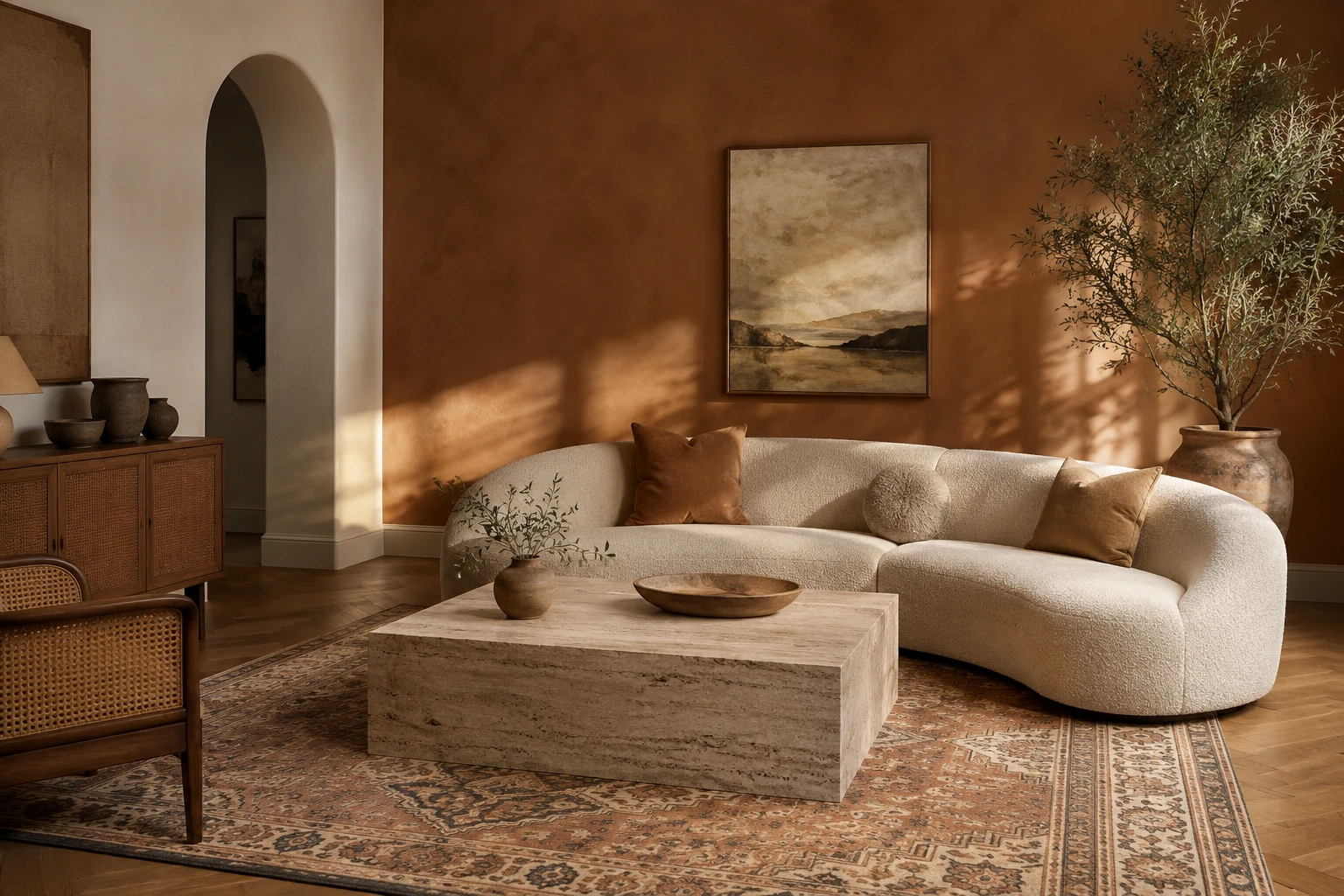
Terracotta is the anchor colour, but the look is really a whole family of warm tones working together: rust, clay, ochre, caramel, warm cream and chocolate brown, usually softened with a companion like olive or sage green.
The palette
- Terracotta and rust are the heart of it, from soft clay-pink to deep burnt orange. Used on walls, a sofa, a rug or tiles.
- Ochre and mustard add a golden warmth, beautiful in a cushion, an artwork or a single chair.
- Warm cream and oat are the essential neutrals that let the warm tones breathe, on walls, linen and bouclé.
- Chocolate and coffee browns ground the scheme and stop it feeling flat. This is the sleeper hit of the palette right now.
- Olive and sage green are terracotta's best friend, the natural companion that keeps a warm room from feeling one-note.
The materials matter as much as the colours
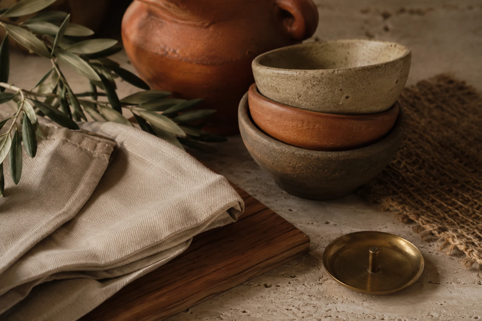
Earthy interiors live or die on texture. The palette is warm, so the materials need to be natural and tactile to give the room depth:
Natural timber (especially warm-toned oak and walnut), rattan and cane, jute and sisal rugs, travertine and warm stone, handmade ceramics and clay vessels, linen and bouclé, and aged or brushed brass rather than cold chrome. Layer several of these and even a simple room feels rich and collected.
Room by room
Living rooms are the natural home for the look: a bouclé or linen sofa in oat, a terracotta or rust rug, a travertine coffee table, rattan accents and olive branches in a clay pot.
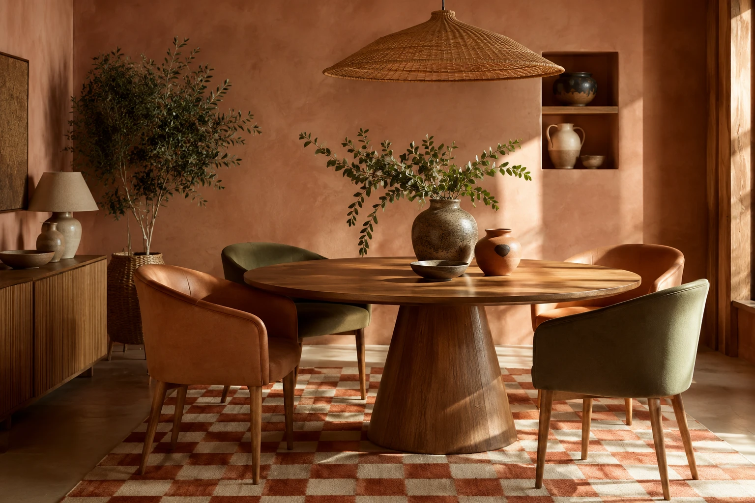
Dining rooms come alive in warm tones, especially under evening light. Think a timber table, terracotta or clay walls, and green or caramel-leather chairs.
Bedrooms feel instantly cosy and hotel-like in caramel, clay and warm cream, layered with linen bedding and timber.
Kitchens warm up beautifully with timber cabinetry, a warm stone benchtop, and brass tapware instead of chrome.
How to get it right (and avoid the pitfalls)
- Balance warm with neutral. All-terracotta everything gets heavy fast. Let warm cream and oat do the breathing room so the rich tones stand out.
- Layer textures, not just colours. A warm palette can read flat without tactile contrast. Mix timber, stone, rattan, linen and ceramic so light catches different surfaces.
- Ground it with a dark and lift it with green. One deep brown or charcoal element anchors the scheme; a touch of olive or a real plant keeps it fresh.
- Mind the "1970s" line. Terracotta done wrong can tip into dated brown-and-orange. The modern version leans into softer clay tones, plenty of cream, and natural materials rather than heavy, matchy orange.
- Follow the light. Warm tones flatter almost any room, but they positively glow in warm natural light, so lean into lamps and warm bulbs rather than cold overheads.
The tricky part: warm tones are easy to overdo
Here's the honest challenge with an earthy scheme. The colours are gorgeous individually, but they're also easy to get wrong together. A terracotta that looked perfect on a swatch can read muddy against your timber floor. A rust rug can clash with the clay wall you chose separately. Too much orange and the whole room tips from "warm and collected" to "dated." And these are big, expensive commitments to undo once the paint's on and the rug's delivered.
That's exactly what StudioReno is for. You can build your actual room, try the terracotta against your real floor, drop in the rug and the sofa and the timber you're considering, and see the whole warm scheme come together as a photorealistic image before you spend a cent. Test the balance, catch the clash, and only commit once it's right.
Design your own warm, earthy room in StudioReno. Free early access →
FAQ
Is terracotta still in style? Yes. Warm earthy tones have moved from trend to mainstay, replacing the cool grey palette of the last decade. The modern version leans softer and more layered than the heavy terracotta of the 1970s.
What colours go with terracotta? Warm cream and oat to balance it, chocolate brown to ground it, and olive or sage green as the natural companion. Brass and timber warm it further; avoid pairing it with cool greys, which fight the warmth.
How do I use terracotta without it looking dated? Lean into softer clay tones rather than heavy burnt orange, use plenty of warm neutrals to give it space, and layer natural materials like timber, stone and rattan. Balance and texture are what keep it modern.
Is earthy the same as boho? They overlap but aren't identical. Boho is more eclectic and pattern-heavy; the current earthy look is calmer and more pared-back, letting the warm palette and natural textures do the work.
What's the difference between terracotta and rust? Terracotta is the lighter, clay-pink end of the family; rust is the deeper, burnt-orange end. Both sit in the same warm palette and work beautifully together.
The takeaway
Warm earthy interiors are cosy, grounded and refreshingly timeless. Anchor with terracotta, balance with warm neutrals, layer in natural materials, and ground it with a dark and a touch of green. Just test the palette together first, because warm tones are as easy to get wrong as they are lovely to get right.
Try your warm earthy palette before you buy. StudioReno early access →